Tuesday, 31 May 2016

Cecil Beaton

Cecil Beaton was a fashion/ portrait photographer in the 1950's and 60's. He photographs in black and white and often uses high contrast to capture his subjects. Beaton often used popular celebrities of the era such as Marilyn Monroe, Audrey Hepburn and Elizabeth Taylor. Most of Beaton's photographs are of women usually doing poses with flowers and often with their hands in graceful movements. 

In this photograph of Marilyn Monroe he captures her personality and shows her as not serious.He captures the glamour of the time which is still sometimes used in magazines today. I don't think they seem old as they have a contemporary feel to them as well. His portraits are often close ups of the face. I like how his portraits do not include colour, I think it adds something to the photograph.

Monday, 23 May 2016

Essay on two photographers


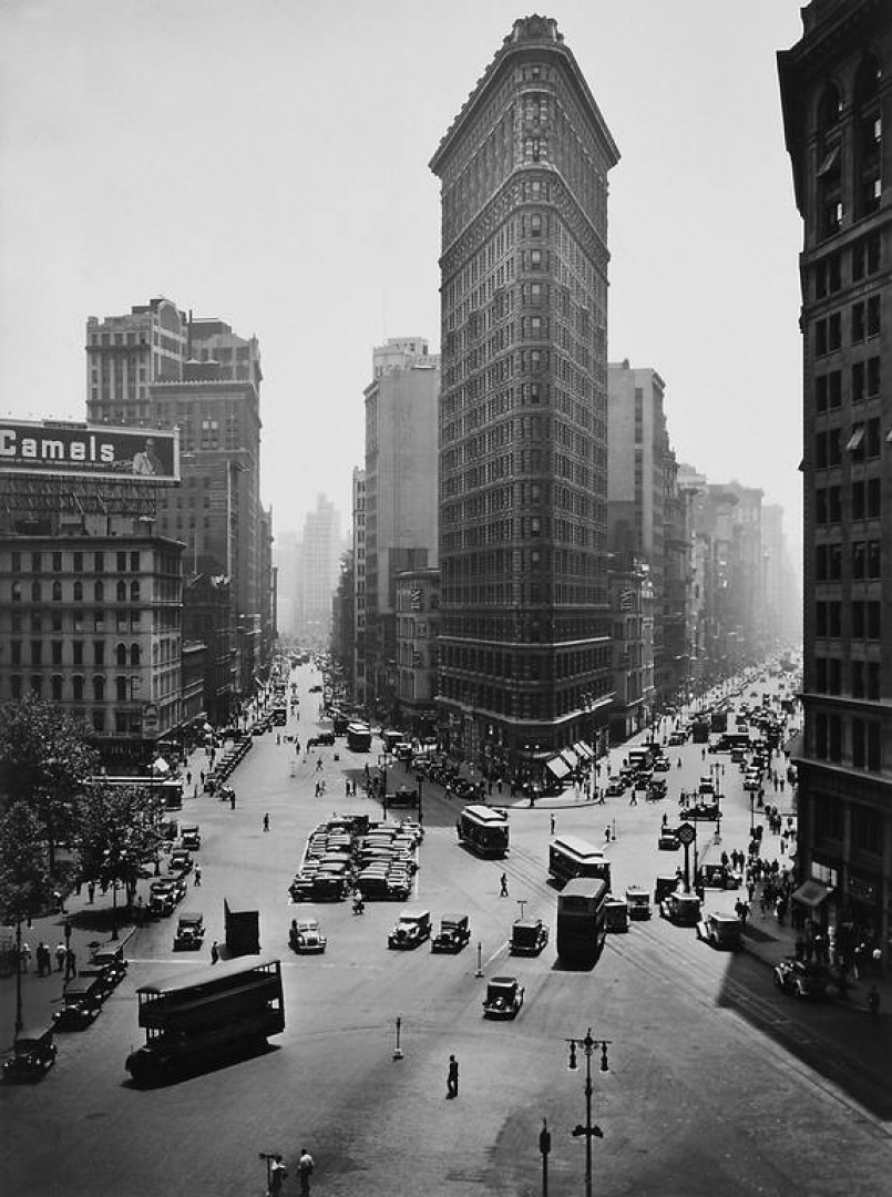
In this essay I am looking at two photographers for my location photography unit. Both photographers had to be taken from ones I had looked at threw out this unit. The first photographer I am going to write about is Bernice Abbott, her photography is based in a documentary style as she takes photographs that show life in the 1930's during the Great Depression. I like how her photographs reflect the time she lived in, they show architecture mostly in the Art Deco style popular during that decade. Her photographs are in black and white and I think this adds to the feeling that the Great Depression is quite a dark and bleak time in history, I know that at that time black and white photography was the main choice as colour was expensive. Her style of photography is more complex than other photographers as she seemed to use many different styles but I'd say it would be documentary photography.  One thing I take from her work is that it is Important to take pictures of not just nice things but also things that are real, things such as poverty because these things people often don't want to see. I also find it interesting to think what she was thinking when she took these photographs, what went through her mind during that moment. In contrast I am a fan of her architecture photography which she takes her pictures, from different views and shots. Over all I do like her photography as she is documenting an important part of our history.

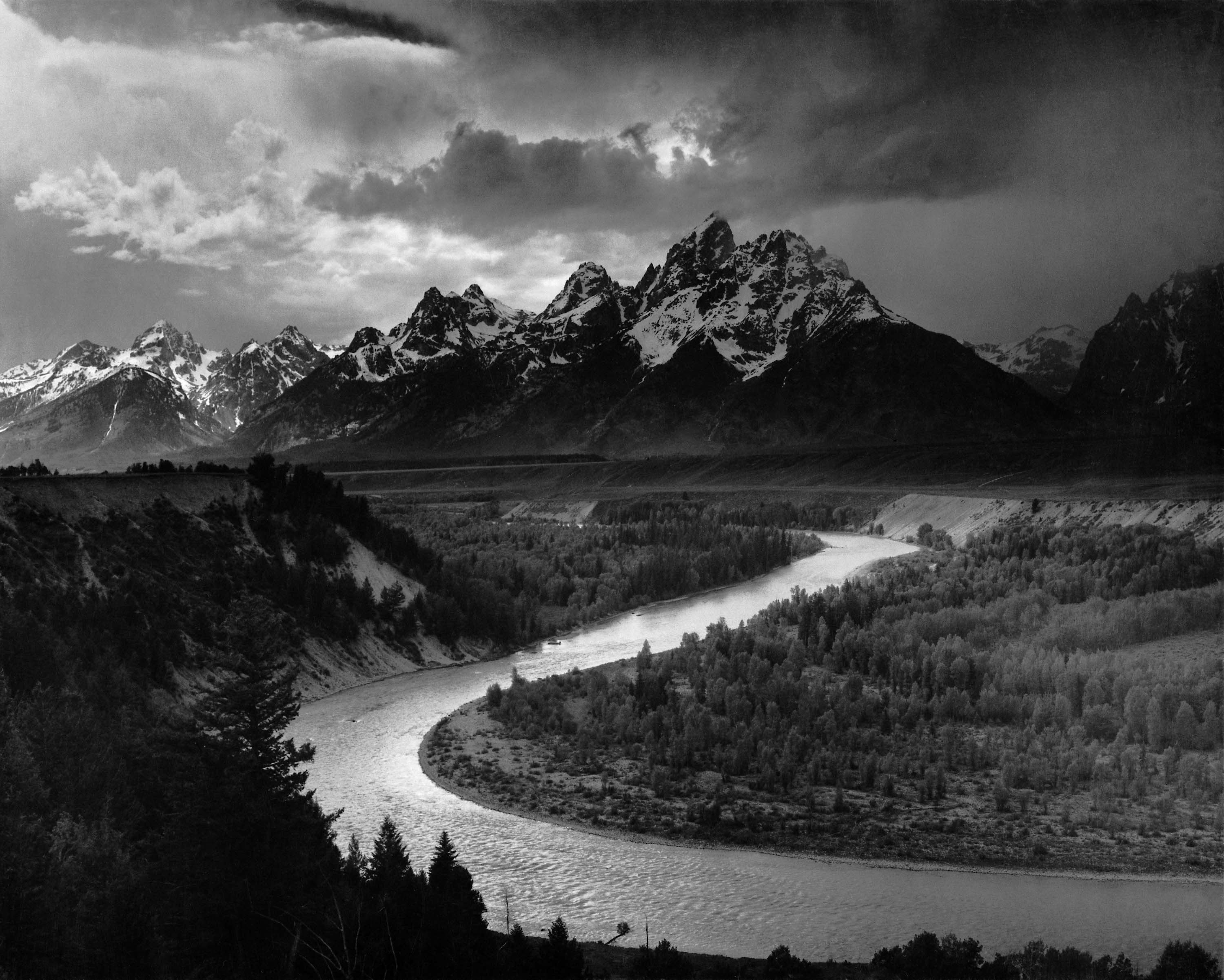
Ansel Adams is the second photographer I am looking at in this essay. I really like his photography it is very much different to my last as it is landscape photography he takes. His photographs are amazing scenes in nature which are taken during the 1950s or 1960s he still uses black and white photography and this makes his work dramatic and really draws attention to the landscape. His photographs often feature mountains, clouds, rivers or lakes in the United States; they don't seem to have an age as they are in nature and could easily be taken now, because they are timeless as black and white is still widely used. When Adams took his pictures he would have had to plan what he was going to take to get his picture at the right moment and angle which to me seems very complicated and not just taken quickly.

Both these photographers have one thing in common but they are completely different in style and subject. They both black and white photography perhaps for different reasons due to the subject matter of their photographs, for example Adams seems to use black and white photography to bring out the drama of the landscape and draw the eye to the contrasts. Abbot however uses this to show life during the Great Depression and also black and white photography was likely to main the main choice then as coloured photography had yet to take off. Subject matter is the largest difference between these photographers. 


Ansel Adams

Ansel Adams was a photographer for most of the 20th century; his work was landscapes of which he took in black and white. I like his work because the black and white bring out the contrasts and make it more dramatic and epic. His landscapes lose something with colour but this is what makes his photography stand out. Adams photography is often of snow or clouds and the contrast with rock (mountains) and water, so the black and white stand out more. When I am not looking at the colours in photographs, I see much more details, which help in his monochrome photography. I found a photograph of his I liked, because of the shapes and angles he has used and how the image seems to be at the perfect point. Adams photography often focuses on nature, not the man mad but this is contrasted with his use of black and white which ages the images in a way. It could also be argued that they look more modern as they as pictures look fashionable now, as black and white photography is still very much popular.

 This picture below shows a scene of a road using perspective, as it looks like we are walking along the road or in a car and about to go downhill. The road gets smaller and less dramatic in the distance and ends in a point. The clouds add a great sense light and are less harsh in contrast to the sharp road and distant mountains. The bottom and the top of the picture are both light while the middle is dark and it draws the eye to the centre of the photography. I like the use of white down the centre of the road as it directed the eye. The road is also very detailed with tire marks which add to the picture. I really like his photography; it seems ageless as it can be used in any style, with their focus on nature.

Sam Cornwell

Sam Cornwell is a British photographer who visited our college earlier this year to do a presentation, he showed us how older cameras work (wet plate collodion) which I found quite interesting. He also showed us some examples of wet plate collodion printed on metal, which were of portraits. I found looking at his work interesting as well, his photography changed a lot in his work over time and he did not just work in only one branch of photography.
 I decided to write about one of his earlier photographs because I liked how he had created and planned it. The photograph is this one, of which he has included many images (paintings and photographs) in a street and made one large photograph altogether, it took him hours to get right and I can see why. He had to get the colour right and too check that the image looked in the right order, so he could correctly get the smaller pictures into the focus. I don’t know how he decided on how this would work. I like this image from its use of colours which work well together. I also liked how he used large and small images to build this up the photograph. The subject matter of the pictures within in the photograph are all form different subjects and topics, so this makes the viewer look closely. There is no centre where the eye leads as there are so many colours and topics to focus on just one.

I learnt a lot from Sam Cornwall's talk, I learnt how as a photographer, it was not just about taking pictures but also coming up with ideas.

Thursday, 12 May 2016

Marbling books

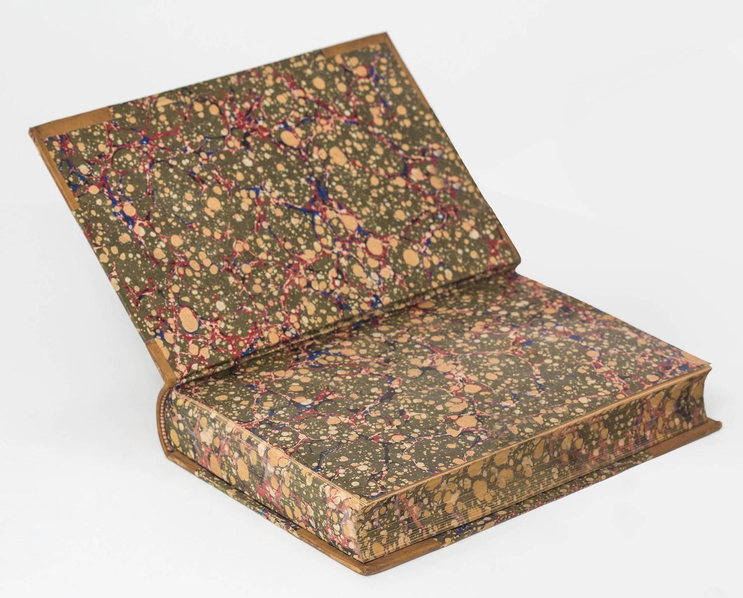
This Persian or Turkish ebru, 19th century books, It is also known as marbling.
One of the ideas I am going to use for paper making is to use marbling in books just as how books used to feature in the 19th Century.
I really like them, as it adds a bit of colour to the book often when they are very simple. 
I did try this and I think it has worked .
This style has gone out of fashion.
I am going to try this in my own work when I make my paper books.

Book Binding was quite easy depending upon which one I created. The zig zag binding was harder to create however. When creating the final one it will have to be very neat.

Here are some more examples.
I also found some examples where paintings were used instead.


Tuesday, 3 May 2016

Invite Card

When I started my invite card, I had no idea what I was going to do but my current idea has come from a idea of the board, I read the word Miniatures of the board and then I researched them online, I was very impressed by the detail and skill that went into these painting and how personal they were. Miniature Portraits were very popular in history but were very popular in the 18th century and 19th century before photography. The paintings are very tradional as they are usually similar to photographs.
I decided that I would use this idea for my invite card because I felt that it would make the invite card more personal and would relate it to art as it had to be painted.
I next had to decide what I would do this on,
I also needed to decide who these portraits would be off.
I first thought of the all the students in the classes but the idea was not popular. I then decided I would try an example, so I used Grayson Perry's portrait of the wall and then copied it and then looked at another photo of him to finish. I then decided that I would paint artists that people had heard of.
Tracey emin was the next artist I decided to paint, she too was on the wall of the class. So I decided I would paint her but I felt that one I did of her was much better than my first. The Minitures I did were on post it notes as I thought that for my final peice I could make an invite card that could be taken apart and parts of it kept.
I thought that if the text was on the other post it note it could be kept as a reminder of the date. I also thought that underneith the post it notes could be a pattern that looked at art and graphic design, I have looked at stained glass as a idea.

In the process of making this design I thought it would be hard to recreate the portraits but I liked the idea because I felt it made it more than just an invite card. I like the idea that something was made by an art student and painted.
I think the post it note works as they can be swapped to the artist you prefer and can be changed about and taken off. One problem with this however is if they lose their stick and just fall off. another fault is if you put it in a bag the post it notes may bend; they were not made to last forver, so I may need to rethink the stick option
I think this gives post it notes a good usage as they are often just thrown in the bin after leaving a reminder but are also personal if left with a compliment on them.

Some of the other portraits are above. I found oil paint worked best for these minitures. I used water colour on the bottom one which was meant to be picasso in black and white.
I think my best one was of Frida Kahlo I used a round shape and blue for the back ground which is often used in miniatures.

Friday, 12 February 2016

David Hockney

David Hockney, is a photographer and artist who I have decided to look at as one of the photographers for location photography. His work is different to most other photographers as his photographs are built up of many small photographs that built up to a larger photomontage. I like his works as he is creative with his choice of subject matter and he sometimes gives an almost a panoramic view. I did try this myself and it is much harder than it seems to be. The small images are often of different textures such as the blue of the sky or wood of the floor. Most of his photographs are buil up with many tiny images, he does not just take a small amount and it must take a long time to take so many photographs of each small details. I like his photography where he looks closely at people and how they move, there is one with a older man with a ciggerette and you can see how the face moves and how his expressions change. He doesn't use many styles but photomontage as in many other photographers will often look to get the perfect scene, I like how he photographs everyday scenes.