Friday, 25 September 2015

Laser and camera


Here are some photographs I did using a laser it was very difficult to get the camera to the right timing to take these and was not as easy as I had thought. I liked how the dark and the background and the lasers gave the affect of stars or even fireworks. I was inspired by the artist Gjon Mili who took some with Picasso in them.
The camera did not work with the single stroke laser as in the photo below only with end on the green laser to create the affect it created.

Wednesday, 23 September 2015

Humphrey Weightman

Humphrey Weightman is an graphic designer, who came into college today to speak in front of the class. He showed his work and did not show a power-point and it was interesting to hear from someone who works in this business. He started by speaking about when he was young and how he developed in an interest in graphic design. He also said he was good at many other things such as music and fashion. He also mentioned he worked in women's fashion early on in his career but had always wanted to stick to being a graphic designer, although he kept going into different things. He is now a graphic designer and has been working as one since the 1970's. I found his album covers from the 1970's very interesting, he had used a photograph of a woman looking up in black and white. He said for this cover he took the picture rolling apples to the woman and in the image she holds one apple. This picture seemed quite modern so it could work now, though as he said the typeface he used was "very" 1970's: this album sold 15,000 copies. In this part of his career he said everything was hand done, the letters had to be at the right measurements and it would take hours (8 hours) to get this right. He mentioned letters would have to be cut out, which I can't imagine as everything now is done by computing. He said that this business is very "labour intensive" and would include maths and counting. He did work early on in his career as a sales man having people working for him in a studio but once the computers were created he can work from home and he also did not like this responsibility of taking care of other peoples careers and wages. He worked for chicken farmers in the 80's designing uniforms, he claimed he did not like this work but also said "If you come to a fork in the road take it" which makes sense. Unhappy with his job at this time he went to Spain and became a musician for a short time before going to America, where someone had asked him to work. In America he claimed that he had to work eight hours a day to get work done often working to get work done in a short amount of time (such as 3 weeks on a project). In the 1980's Humphrey along with those who he worked with created software along with a mainframe. Humphrey said it was important to use fashion in work as it would always be up to date and also to incorporate style as-well. This meaning customers are often looking for the most current design.

What it takes to be a graphic designer:

  • Flexibility, being able to work at many different things and times.
  •  Hard work, otherwise the work won't get done.
  • Not to do it on your own
  • Back up information, businesses fail if things get lost.
  • Keep Organised 
  • Get into working environment 
  • Carry a camera to take pictures, not a phone one
  • Keep work in a separate room
Graphic Designers are not likely to have fame and are likely to earn 25,000 a year, they will have to pay a lot to keep up with technology change and buying current software.

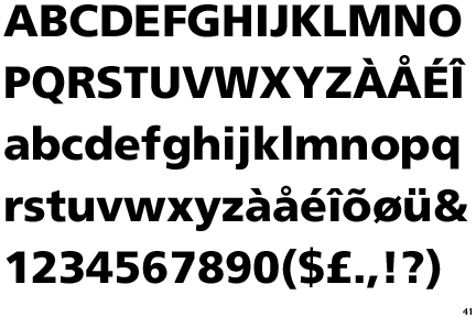
It was Interesting what he told us and it can be done in any field of design. He showed the class some of his different works including the disabled rights handbook which I have included in the post. He had designed two of these books in the past and had only a few weeks to create them in. The books are also very thick with a lot of text with in them. In his other works he uses photos he takes and includes them. In terms of typefaces,he uses Times New Roman and also Frutiger similar to Helvetica. I have included an example of Frutiger(another was Univers).  He mentioned the difference in covers in books and leaflets and quality such as gloss and matte and how these relate to fashion


Humphrey mentions too save work at least 4 times and back every-thing up, I lost work before on the computer so this is a good idea.
Fires and losses are often what makes a business fail from losing information.

He showed us how he keeps organised using some scheduling which looked very confusing. Humphrey mentioned how a young student was able to create the road signs in the UK and how they were very simple. I agree that these road signs work well because of the simple readable text used and the colours also used.

Some More Tips for Graphic Designers:

  • Don't become friends with customers or suppliers
  • Charge by the project
  • Not to loose temper with a client, They can make you pay to redo work!
  • Use bold colours, he mentioned red, to distract from mistakes.
  • 3 is a good number when showing the customer work, and making them reject one. ("humans are programmed to reject")
  • Do not tell the customer what to do

He also advised graphic designers to buy Adobe Publishers, a white board a good scanner and a Mac or PC 

The talk was very interesting as I learned a lot about this career, but it did not attract me to this career as it sounded very complicated creating the design. He said it was complex but now easier because of computers but still I don't think being a Graphic Designer would be right. I did learn a lot that can be included in my art work including typography.
I liked much of his work, most of all I like the very simple white covered books, one had a glossy white image but some I found a bit too simple. I know that is the point however and his style. I was glad he was able to come in and talk to the class.

Friday, 18 September 2015

Photography and Photoshop


Location Photography, is our new unit and for this unit we have to learn about photography. So far I have learn a lot. I have learned so far about the use of green in photographs, the line and focus. For the first task I was asked along with the class to take 6-10 pictures around the Borders College campus; we were not allowed to look at the photos on the digital screen instead we had to look through view finder. To begin with the focus was difficult and it appeared blurred but depending on where I stood it was clear. It was tricky to start with but I soon got used to taking them, I think I took more than I was meant to. The picture I took was of the side of the college which I tried to get a perfect image but It was quite hard. I was told when the images were shown in front of the class to avoid green (grass) as it can often be distracting. Many of my pictures were taken from an angle.


Displaying darker grass.jpgThis was my second picture where the green grass was bright so in this image I darkened it but it is still distracting drawing the eye. The shadow as mentioned when showing this image. I liked this view because of the angle and the contrast of the colors and textures.
Displaying window refection.jpgHere is one picture I took from inside of the college facing the outside. I like the shadows and the bold white and black in use. I also the reflection through the glass. For the Photoshop on this image I added contrast.
 Displaying yellow digger.jpgFor this image of the digger I cut the grass out it and added contrast to the image in Photoshop. I like the colors and how they were so bold and stood out.
 Displaying photowalk.jpgThis was the path outside the college, I like the contrast of the plants and the path, and wall.
Displaying barbed wie.jpgI took one of the barbed wire on the fence which was in contrast to the bright blue sky. This one was difficult to take as the wire did not appear in the view finder. I edited with contrast and cropping.
For this image I made the whole image black and white, I was just trying out the Photoshop and the sky blue. I have seen pictures done like this and wanted to try it.

Wednesday, 16 September 2015

Sam Cornwell

Sam Cornwell the photographer was the guest speaker this week in our art class. Cornwell did not choose to photograph landscapes instead focusing on something that can age. Windows were a common choice at the beginning of the slide show, he said he like the clean appearance, with no distractions. He then began to show us a more colourful works, such as the kites which he one an award for. I liked these works but I thought his work got better as he went on. He began to experiment more once he had gone to university which focused more on the art side of photography. He began to get used to it; he then showed us how different his work was after it was much more experimental and abstract. He called this part "Finding His Voice", this was the first time he got to use dark room photography. His told us about how different black and white and colour was when in the dark room, he told us that it would take 8 seconds to process these images. The first "Wet Plate Collodion" was in 1850 apparently at Lacklock abbey, this is where his next project took place. He created his photos of a large window in Lacklock abbey, they were in black and white and it was highly contrasted. He sold it but regretted it afterwards. He then showed us this camera which was really very simple, he also showed us the hood which keeps the view dark so it can focus. A bit of glass was put over to take the image. The chemicals used were called silver nitrate and Collodion. Another similar picture he took with this method were portraits, which he passed around they were on metal. 

Condensed landscapes, they next images were of three landscapes that took three years to create each. He started by taking pictures in places such as Blackpool, Chicago, they were very highly contrasted. they were very good. Cornwell during this time took no pictures but those three as he was focused only on the perfect. I liked these images and they looked rather complex. I found the whole idea good but I can see what he meant by too perfect. In the next part of this career he started to focus on something completely different. This time he bought 127 disposable cameras, with these he would take as many pictures as possible as he only had six months. He bought the cameras in Morrisons as they were only a pound each and took as many pictures as possible everything from wallpaper to processing all the images on to one image. The Next part was about his family and how this inspired him filming his son every for a second a day, he called this A Second A Day From Birth. It was interesting to see how many areas he has worked it was great. He mentioned Polroid cameras where the image comes straight out once the image is taken. This now reminds me of one I had from years ago and how simple it was. 


Atstrophotophy, is photography of space and this was favourite part of his presentation. What I liked about it was the clear darkness and mystery of space. He would go to a place called Kielder Observatory and take images. He got one picture of the solar eclipse and one of Venus. Another of his pictures included the torch of his iphone to create affect.

In one of his works he showed us were of his red cameras of which he had created a sculpture using all these red cameras. This work was called Tacky red cameras, He also had used a 3D printer to create one of these cameras which was impressive.

Synesthesia Party Posters,
For this he asked a friend of his with synesthesia of taste to create posters of what political parties taste like. For the Conservatives he said they tasted like hard toffee, the Labour Party tasted like an eraser, Lib Dems were rubber bands and UKIP were wet tweed and sweet cakes. I remember seeing this at the election as Niall had shown us them and it also got posted in the Guardian which I remember looking at after college on that day,

Overall I really thought it was a great presentation, I enjoyed seeing how his work transformed after he had went to college and I think it helped me with the idea for my Extending Specialist Techniques unit of which I am considering photography. At the end I looked in his large camera with the hood to keep out the light, but I saw nothing, later I was told the image was upside down.
 
http://phogotraphy.com/2015/05/02/ge2015-party-posters/


Tuesday, 15 September 2015

Creating Chaos

Last Thursday the class was spilt into two groups and we were to create chaos with two objects that we had each. For this our group decided to split the design into two parts one side was chaos, the other was order and neat. The objects on the order side were places by there sizes. The other side was turned up tables and hanging chairs and wires. So I took some photos and I also chose to film the video we were to make showing the chaos. It took a long time to film and we had to keep swapping and it was funny as something kept going wrong. We also had people in the group make sound affects. We tapped and banged on objects to create the sound affects. I enjoyed this exercise; it was fun.


Thursday, 10 September 2015

wire Sculpture

The class was asked to create a wire sculpture of objects we had picked out the middle of the table, from the collage we had done the day before. It was not as easy as I thought it would be, the wire was  hard to get into shape. I choose some sort of pastry dish, but I am not sure. It looked simple and it seemed simple to create the overall shape. I had to tape to stick it together and small bits of wires to connect the top and bottom circle. The inside did not look like the original object, I tried to get the wave affect but it turned out to be very different. Overall I did not like working in this material. 

Wednesday, 9 September 2015

Oliver Reed

Oliver Reed came in to college today, he spoke about his work. He is an artist who uses many different styles working completely with landscapes. He often reinvents his work focusing on different ways to use landscapes in his work. He created sculpture outdoors (in Connecticut) and has also burned it, I was reminded of Andy Goldsworthy when he show us this sculpture because he works outdoors using natural materials. I liked his work and I enjoyed seeing how he uses different materials such as aluminium and also plywood, he spoke about his dislike of the texture of regular canvas boards. His work is interesting as it is always changing, he will change what he makes often and will focus on new things. I like that he worked landscapes which was so different to the other artist who had come into show their works, they used buildings in their art. Reed looks at other artists to inspire his work he mentioned 19th Century painter Turner and he showed us some sketches and also another artist called Fu Baoshi, a Chinese artist. I found it intresting he only works with what he knows, he doesn't work in urban settings in his work, he likes hiking and nature so this makes sense. Overall I enjoyed his work and it was interesting to see how he mixed materials and media in landscapes.

Poster for European migrant crisis

We have been asked to create a poster on the European migrant crisis 2015.

For this poster I have decided to do some research into the crisis, I have looked many different newspapers. The finding should that most were against the migrants entering the Europe, however many did show an out pouring of support for them to be allowed in. The migrants won't stop trying to get into Europe. It is only one year till the EU referendum elections here in the UK and it seems because of this crisis, many will want to leave the EU. The situation is due to war in the middle east, Syria and Iran are the Countries many are coming from to come live a better live here in the UK. The UK offers benefits such as a comfortable home and safety, which is something they didn't have much off where they came from, Europe to them is like the American Dream, an ideal to live a middle class lifestyle with a car and a home. It was the poor during the 19th Century who had to escape to America longing to live the American Dream, now they are all part of a melting pot. They were apposed at first by WASPs but were accepted by time. Should we allow these Migrants into the UK, do they not deserve to have what we have.


For this poster I have looked at old war posters, many of which had flags. I also have looked at banksy's work which is anti political art. No one knows who banksy is, and he paints graffiti or street art.


https://blogger.googleusercontent.com/img/b/R29vZ2xl/AVvXsEhXydY28EntowPsJj-7Dh-GAYWENiIKx3u0z_4FIHdWAtrLKJJHBcujc2h6rxaYEuY5KCQchhsSkKturJ81yyAwXpvl3ZGcaMqIKoj4CKQmlnqcQauXWk-dhyyN8QIdFRZ7bjmlQ2miZdo/s1600/ImmigrationQuota1921.jpg
 For one idea for my poster I used a the British Flag, using Photoshop, I used words that the migrants had used in their posters. I did not want it to look perfect, i lived how the water could relate to the water, the cross a sign of no entry. I liked the British flag so I also tried another idea by this time using a map of the English Channel, I also made the UK showing in the map, using the English flag, I used the paint tool on Photoshop to get the flag. I have used Helvetica in this title because after doing my typography unit I found it looks best. I used grey for the text. The poster is mostly white which works well with the Helvetica. For this poster I was getting across the similarities between the American Dream Ideal in the early 20th century and late 19th Century. It was the British who often went and were not always welcome. The melting pot ties in with this as well and that is why it has been included. I think it works well, I changed the American flag that liberty is wearing to a British Flag.