Tuesday, 27 October 2015

A Rake's Progress, by William Hograth

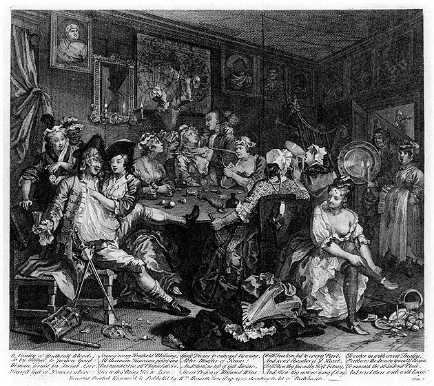
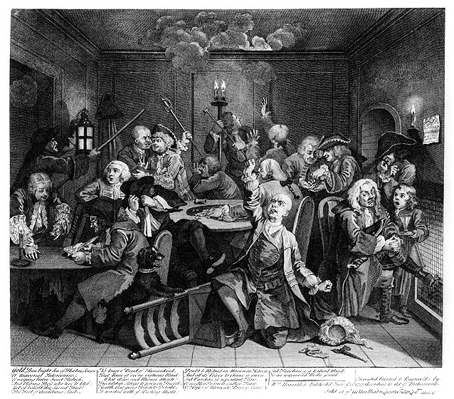
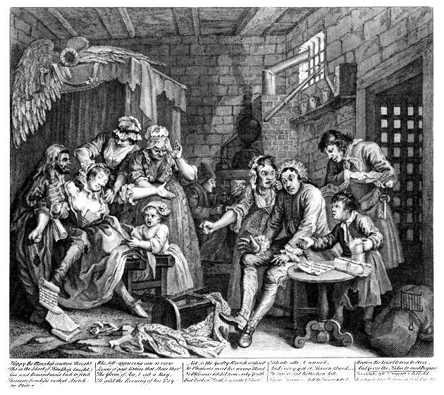
William Hogarth is a artist illustrator who used satire in his work, one of these was called A Rakes Progress. The set of works looks at the fall off a rake (Tom), the man bellow and how his life falls apart by making the wrong choices. In the first image he inherited money from his father (who appears counting money in the painting above the fireplace). His pregnant fiancée, Sarah is rejected by him and he does this through all the pictures. The second image shows Tom (the Rake) being entertained by musicians who are dressed in fine clothing. The third one  is of a wild party at a brothel where the prostitutes steal some of his things. they have black spots to cover syphilitic scars. In the fourth image he is being taken to a celebration at the palace on a sedan chair. He just avoids being arrested for debt by bailiffs by his former fiancée Sarah. I like how oil is being poured on his head like anointing and yet he does not take this as a blessing. In the fifth one he is being married to an old rich maid, who is also ugly, he does this to try and get rich again but he is also looking at the younger maid of his new wife. Sarah is in the back ground trying to get into the wedding with her baby mother. The sixth image is of him at a gambling house and losing all his new fortune so he is pleading for it back. He is disheartened as all is lost in the seventh image and he is thrown in debtors jail. He begins to go mad, his angry new wife is here and as is Sarah who has fainted in shock of this. The final image he has gone insane and is placed in Bedlam mental asylum where he is chained and barely clothed and still ignores Sarah who is there comforting him. The other people there are meant to be mad, and there are women who are watching them perform.
Overall this is quite tragic, the drawings(prints) are placed out for the first time in a story board. It was interesting to see how he had what he should of done right in front of his but he ignored this and continued to do the same thing which led him to be mad.
The pictures themselves have small things representing things which tell the story.
Like the story there is no real humor but more tragedy.
William Hogarth - A Rake's Progress - Plate 1 - The Young Heir Takes Possession Of The Miser's Effects.jpg
William Hogarth - A Rake's Progress - Plate 2 - Surrounded By Artists And Professors.jpg
William Hogarth - A Rake's Progress - Plate 3 - The Tavern Scene.jpg
William Hogarth - A Rake's Progress - Plate 4 - Arrested For Debt.jpg
William Hogarth - A Rake's Progress - Plate 5 - Married To An Old Maid.jpg
William Hogarth - A Rake's Progress - Plate 6 - Scene In A Gaming House.jpg
William Hogarth - A Rake's Progress - Plate 7 - The Prison Scene.jpg
William Hogarth - A Rake's Progress - Plate 8 - In The Madhouse.jpg


William Hogarth has also done another one like this called A Harlot's Progress.
Hogarth-Harlot-4.png
Here is another of his works called Gin Lane

In it everything is telling you about what gin does to people. The mother who was feeding the baby now drops the baby.
This one is called bear street which is a similar idea.

Quinton Blake

Quinton Blake is one illustrator I am looking at in my Narrative Image Making. Having many of these books at home I remember seeing the drawings, they were quite sharp and simple. I really like his illustrations now and I see how they made the Roald Dahl books stand out so much. I feel the illustrations made the books seem very modern and how they stood out.
Here is one example of Willy Wonka, a drawing done by Blake, when looking at the drawing it looks very simple, he exaggerates the lines and the features. His lines seem free flowing and they don't seem perfect. It looks like he uses water colour for his work and he does not use much shading. His line in his work seems scribbly and rustic.


Saturday, 10 October 2015

Raphael's drawings and sketches

Raphael's work is known for its great works of art during the High Renaissance, during the 16th Century. One of his best known works is the school of Athens which is in the Vatican in Rome. I am looking at his sketches and how he does them, he would often exaggerate the features giving them an epic feel. He is exaggerating the muscles and the lines in the models faces. He must have done many sketches before paintings as he wanted to get every detail right so he must have studied closely each detail closely focusing and correcting. He does not perfect his drawings as many are not finished but they are incredible in detail. Raphael would have practiced regularly to create his drawings. He uses shading well to show this and he gets the perspective right.
http://www.nationalgallery.org.uk/paintings/research/drawings-and-cartoons I found this on his drawings. He seemed to change his mind on the subject while sketching, focusing on certain parts for his painting.

Friday, 9 October 2015

Panoramas


In this series of panoramas I went for a walk to the bridge near the college and I tired out this setting. The panoramas include my shadow and I kind of like how it has worked. I think the shadow on the bridge worked well. The thing I don't like about these images is the quality, they looked good when first taken but once scaled up they do not look as good. I thought this was fun to make as I would turn the camera so far before it took the picture.


For this edited image I turned up the contrast and changed it to black and white I think it worked well, but it did need the extra contrast.


Thursday, 8 October 2015

appying photoshop to my laser pictures

Photoshop and my laser pictures. 


I like when using Photoshop when you do something you like and it adds to the picture. The thing about these laser pictures I took a few weeks ago is that they were only green and using photoshop I could bring out the vibrancy and the colour in these images. When Photoshopping my pictures I often use black and white and contrast but this time I tried some different things because they are lasers.


This one I was one of the best ones I took, So I decided to use the solarized filter. I did not know what this would do so I just tried it too see how it worked, I was really pleased by the finished result. It reminded me of a Jackson pollock style painting, he would flick paint using a brush to create a splattering affect.


 Another of the photographs I took of the laser was this one, again it was completely green so I decided that I would change the colour adding yellows, oranges and a bit of red. I used the quick selection tool trying on each area i wanted to change and used hue and saturation . I liked the end effect 


This photograph I edited ( the blue one) I decided that the background would be lighter and the laser itself would be less bright, I also changed the color to blue and I really like the affect it looks like marble. I used this again for the second photograph on which I decided to use ombre; the light blue gets darker as it goes like a gradient but instead it had a landscape look, I thought this as the sky looked blue over mountains. The laser looked the smoke moving in directions and how it fades.


Examples of marble and smoke, I did not take these photographs.


This was one image that did not work because of the lighting so I added to the brightness and also made the background darker to show this affect. I used a pink in the background because it complimented the laser image.


I am still getting used to using Photoshop, but I enjoy trying something new with it.

Wednesday, 7 October 2015

David Cass

Today, we had an artist come into do a presentation and it was interesting to see another artist and how their styles are different. David Cass was the artist who came to give his talk for he class, he is a painter and also uses other media's like photography. Cass went to Edinburgh College of Art after leaving school and quickly knew the style of art he likes and has continued to use it; his style is painting on old wood, landscapes or cities. his media is gouache, a type of quite dry paint with a crumbly texture, he also uses water from the sea, often collecting from his travels, I found this creative and it mad his work more unique. Cass used so many different objects that he picked up abroad in flee markets for his work such as old match boxes and working larger on table tops often very old. Cass often goes abroad for his work; taking pictures and sketching, he went to Florence, Paris and Berlin. He used historical information for one set of work such as the Florence flood of 1966. One piece of work I liked was the puddles he created in a farm of which there had been a drought, so it was like a mirage this work did remind me a bit of Oliver Reed who came into speak a few weeks ago. I also found it interesting how he documents his journey and uses this as part of his work, he records where he goes and films and takes images of this. He also creates postcards for £60 each. which I have just looked and I think It is very creative. Overall I found it very interesting the work he showed the class.

So Many Endings (David Cass)

Matchbox Seascapes / Gathered Seconds (David Cass)

Thursday, 1 October 2015

Illustrator: Rodger Hargreaves, Mr men and Little Miss books


Mr Men and Little Miss
 
Illustrator and Author: Rodger Hargreaves

These were some books I found on a bookshelf at home which I think everyone knows. The Mr. men and Little Miss books are illustrated with colored images on every second page. I found out during research that these were done using marker pens. when I looked at the drawings I could see this. The design of these books is simple as the books are usually white with a simple non complex drawing. This is children book collection and they work well for children as they are bright and colorful and stand out and are also very simple in images.

I looked at the book Mr. Happy and how he has created the character to have these traits for example he looks like the sun because he is round and yellow.
 
In some scenes he does not use blue for the sky but white. The colors also commonly clash, such as reds and greens. He uses a black outline around all his is images.
 
These books have nothing scary or too detailed about them, which makes them great for younger children. I enjoy seeing how an artist can only use simple markers to create a book that has great impact and popularity.


Linda Lovatt

Linda Lovatt,
Linda Lovatt came into our class today to speak about her art work. She started by taking a BTEC course, like we are studying. She learnt about business on this course and said it gave her a great choice in what she took. Lovatt then got took a HND course in Visual communications. Much of her early work was Illustrations, this is what she wanted to do first as she worked for someone else drawing things like Winnie the Pooh and Beatrix Potter. Her works were good but she said that there was not much choice in what she could do. She later decided to go for a more craft type of work looking at selling some small 3D objects she made at craft fares. She said she enjoyed this and had a lot of orders. When the business grew bigger she opened the gallery and shop Lovatt Gallery, she also started a business called Beastie Assemblage. Her works are usually things like vintage cups, old pottery and keys to create sculptures. One of her works was a old ship on top of a tea cup, which was interesting to see the different use of materials. Lovatt hires three assistants as they do the boring part of the work as she says. Her work is liked because it is modern, "up-cycle and shabby chic. She does well from her business and her work is very good, she does other works for galleries as well, overall I enjoyed her art. Her work includes clocks, nature topics such as hares and birds and jewelry.