I am now looking at some artists who I can look to when creating my final product in my botanics unit. I chose to look at first in my work book William Morris who was a textile designer, arts and crafts artist and many other things. I Will be looking at mostly his botanical styled wallpaper. The first one I had already known before looking at this unit was Strawberry Thief wallpaper pattern, here is an example of this pattern. I like the detail that has been added. The design has been very successful and has been used on mugs, cushions and even shoes.
 William Morris also looked at many other designs known for their very ornate style usually botanical in theme. Looking at the detail if these are in fact handmade they would have been very expensive and time consuming to create. He used much of his styles for other things, not just wallpaper and I can see why were popular.


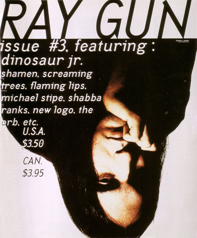
 This back and front cover also show the difference in the covers. Each one is individual; Carson uses the typography well by covering the cover in text. I really like Carson's covers and I want to try a similar style and see if it will work for my front cover.
 The Face magazine was a magazine that run from 1980 till 2004. Neville Brody was the typographer and graphic designer of The Face Magazine. He is also known for his work on CD covers and posters in typography. The magazine is a fashion, music and youth culture magazine. I think when I look at Brody's covers this can be seen, the cover up above is a example of this and as is the cover below. He uses colors well as in these pictures we can see he has stuck to red which matches the lips. He commonly uses a portrait of the model/singer etc. in his work.