Ray Gun Magazine
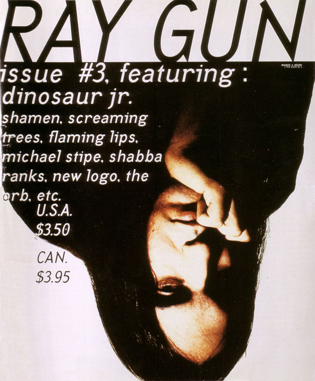
 I have been looking at the magazine of Ray gun magazine covers (1992-2000). David Carson was the art director there, who is known for his typography work. Although the magazine ran for only eight years. I liked looking at his covers, known for their grunge look. I thought that they showed exactly what the magazine was about. Ray Gun is an alternative rock and roll magazine, David Carson uses many different styles. Ray Gun's magazine covers like this one show this, I find the style unusual and confusing which makes the cover appealing because the image is upside down and I kept seeing it upside down, I also almost stuck it my workbook upside down. The colours used are monotone and the text looks like it was created from an old type writer. I can see that this is an alternative magazine from just looking at the cover, the use of colour, the image and the typography show this.
 This back and front cover also show the difference in the covers. Each one is individual; Carson uses the typography well by covering the cover in text. I really like Carson's covers and I want to try a similar style and see if it will work for my front cover.
No comments:
Post a Comment